The 2026 UFL season is set to kick off on Friday, March 27, and it won’t be like anything you’ve seen before.
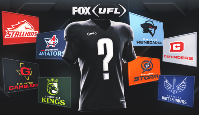
Football fans are buzzing about this season’s new teams, new coaches, new players and new home games themes. That’s not the only change, with teams dropping their brand-new uniforms for the upcoming 2026 campaign. Some teams’ threads got a few minor updates, while other teams overhauled their designs entirely.
New Era, Adidas, and NOBULL are the official league brand partners for the 2026 season. New Era will provide all the team game jerseys and league headgear, while Adidas will provide game shoes and gloves for all 43 games. NOBULL, the league’s exclusive training footwear partner, will outfit every player and coach with premium footwear and apparel to be worn throughout the season. The brand’s logo will be featured on all UFL team game jerseys.
That said, here are the new uniforms for all eight teams for the 2026 UFL season:
Home Uniforms: Gold
Road Uniforms: White
The three-time spring football champion Stallions are introducing a refreshed, modernized uniform this season.
They’ll have a gold home uniform showcasing “Stallions” across the front and a white road jersey with gold and garnet accents that features “Birmingham” across the chest. The helmet is updated to a deep cardinal red.
“A uniform empowers a player, and the Stallions’ new uniforms will command a new era, a new season — one where we are ready to regain a championship for Birmingham,” head coach AJ McCarron said.
Home Uniforms: Navy Blue
Road Uniforms: White
The Aviators’ 2026 uniforms reflect the team’s spirit to “challenge, innovate and conquer the unimaginable.”
There are two editions: deep navy home jerseys that are symbolic of Ohio’s air and space trailblazers and crisp white jerseys for road games. Side pant striping draws from the club’s logo and propeller elements. The blue helmet, inspired by open skies, completes the look.
Home Uniforms: Red
Road Uniforms: White
The defending UFL champions are signaling a new era of confidence, connection and power with their new uniforms.
In both the home and away versions, the striping is representative of the striping on the Washington, D.C. flag, while the stars are incorporated throughout the design.
“Every thread, every stripe, and every detail of these uniforms was designed to embody what it means to play for DC,” head coach Shannon Harris said. “Our players wear more than a uniform — they wear the grit, courage, and pride of the city. Shields up. Defend the District.”
It was important for the Defenders not to alter the previous designs but to lean into and celebrate the past uniforms and their connections to their history, with the team having roots dating back to the league’s launch in 2024.
“As defending champions, we’re not just playing for wins — we’re playing for the city,” said Harris. “From the Potomac to the stands, this uniform captures the passion and energy of our fans, connects our community and inspires our players to rise when called. This is DC — where the bold meet the brave.”
Home Uniforms: Blue
Road Uniforms: White
The Renegades are signaling a new era of resilience, determination, empowerment and independence this season.
The 2026 uniforms incorporate iconic elements from previous seasons but with a refreshed look. The home and away uniforms feature bold pops of red throughout via updated shoulder and pant striping. Home jerseys feature the team name front and center, while the away jerseys proudly feature the city name. The helmet is now an all-black design.
“Our new uniforms represent exactly who we are and where we’re headed,” head coach Rick Neuheisel said. “They honor the toughness and identity this team has built since day one, but they also signal a new era in Frisco. The bright blue, the bold red accents, and that all-black helmet bring an edge and intensity that matches how we plan to play — fast, physical, and fearless.
“When our players step onto the field, I want them to feel confident, empowered and ready to go Full Throttle. These uniforms don’t just look sharp — they make a statement about the standard we’re setting for 2026.”
Home Uniforms: Black
Road Uniforms: White
The Gamblers’ new 2026 uniforms symbolize the beginning of a new era that represents renewed energy and steadfast resilience while continuing to embody the swagger, strength and resilience of Houston.
The team played as the Gamblers in the legacy USFL (2022-23) before being rebranded to the Roughnecks upon joining the UFL (2024-25). Now, the team is reverting to their original name, the Gamblers, for the 2026 season.
The new uniforms feature sleek black helmets, a reimagined logo, a bold spade motif running down the pants and a sleeve patch pays tribute to Houston’s spirit.
“These uniforms represent exactly who we are and where we’re headed,” head coach Kevin Sumlin said. “They capture the swagger, toughness and resilience of Houston while honoring the proud history of the Gamblers. The reimagined logo and spade detail reflect confidence, high stakes and a mindset that we’re all in every time we take the field. When our players step into Shell Energy Stadium this season, they’ll do it wearing something that symbolizes belief in this city, belief in each other and a commitment to competing at the highest level.”
Home Uniforms: Dark Green
Road Uniforms: Silver
The Kings are focusing on uplifting the legacy of Louisville in their 2026 uniform designs, which feature a dark green and lime look at home and another with silver and pops of lime on the road. The fleur-de-lis accent and diamond motifs, timeless emblems of the city, are proudly displayed on the shoulder and across the pants.
“It’s time to suit up,” head coach Chris Redman said. “The Kings’ new uniforms embody the power and determination that our team will take to the field. We proudly play for Louisville, and our new uniforms are a great nod to our city — rich in culture and nobility.”
Home Uniforms: Black
Road Uniforms: White
Orlando’s inaugural uniforms are designed to embody power, intensity and controlled chaos — the calm before the storm. Both uniform versions feature storm-driven shoulder elements and lightning-inspired pant piping cuts. Dark gray helmets, stripped to the essential logo, perfectly compliment the gray, purple and electric orange color palette.
Home Uniforms: Blue
Road Uniforms: Silver
The Battlehawks are introducing a modernized design that builds on the franchise’s most recognizable elements.
St. Louis’ iconic Gateway Arch is featured more prominently in this year’s design, while the Battlehawks mark appears on the sleeve. Home jerseys feature “Battlehawks” across the chest, while the away jerseys proudly have “STL” front and center. The helmet has been updated with a darker finish to add depth and edge.


